CHECK IT OFF
Step 1: Gather your materials
Oil Paints
(traditional or water-mixable)
(traditional or water-mixable)
□ 265 Transparent Oxide Yellow
□ 504 Ultramarine Blue +++
□ 419 Transparent Red Ochre +++
□ 504 Ultramarine Blue +++
□ 419 Transparent Red Ochre +++
◫ 409 Burnt Umber +++
◫ 408 Raw Umber +++
◫ 411 Burnt Sienna +++
◫ 389 Alizarin Crimson +++
◫ 408 Raw Umber +++
◫ 411 Burnt Sienna +++
◫ 389 Alizarin Crimson +++
◪ 311 Vermilion +++
◪ 403 Van Dyke Brown +++
◪ 522 Cobalt Blue (Ultramarine Hue) +++
◪ 403 Van Dyke Brown +++
◪ 522 Cobalt Blue (Ultramarine Hue) +++
■ 105 Titanium White +++
■ 701 Ivory Black (Bone Black) +++
■ 303 Cadmium Red (Light) +++
■ 222 Naples Yellow Light +++
■ 227 Yellow Ochre +++
■ 228 Yellow Ochre Light +++
■ 701 Ivory Black (Bone Black) +++
■ 303 Cadmium Red (Light) +++
■ 222 Naples Yellow Light +++
■ 227 Yellow Ochre +++
■ 228 Yellow Ochre Light +++
Mediums
(choose equivalents from your preferred brand)
(choose equivalents from your preferred brand)
- Universal painting medium (general-purpose medium for layering)
- Glazing medium (for transparent layers)
- Brush cleaner (solvent-based or water-mixable version)
- Texture medium (e.g., fine marble dust for impasto techniques)
Brushes
1. Wide flat synthetic brush (size 20–30) For applying gesso, underpainting, and imprimatura layers.
2. Round synthetic brushes (sizes 0, 1, 2, 4, 6)
Ideal for fine details and soft transitions.
Ideal for fine details and soft transitions.
3. hort flat synthetic brushes (sizes 4, 8, 16)
For defining sharper shadows within transparent layers.
For defining sharper shadows within transparent layers.
4. Long flat synthetic brushes (sizes 8, 10, 16)
Used for glazing and creating subtle transparent layers.
Used for glazing and creating subtle transparent layers.
5. Filbert synthetic brush (size 8)
Perfect for soft transitions and light/imprimatura work.
Perfect for soft transitions and light/imprimatura work.
6. Large round brush (size 16–20, hog bristle)
Suited for impasto and thicker paint application.
Suited for impasto and thicker paint application.
7. Synthetic fan brush (size 4)
For blending and creating soft color gradations.
For blending and creating soft color gradations.
Additional Materials
- Model or reference photo
- Palette (approx. 30 × 40 cm) — rectangular; wood, paper, or glass
- Mahl stick — for steadying your hand during fine detail work
- Gesso (plus water for thinning)
- Fixative spray — to set your charcoal or chalk sketch
- Paper towels
- Painting surface: Panel (ACM Dibond or MDF with 3 layers of Golden Gesso), or Canvas (linen with 3 layers of Golden Gesso)
- Charcoal (or white/red chalk)
- Damp cloth — for corrections and soft transitions
- Palette knife (blade 8–10 cm) or spatula for impasto/texture
- Fine sandpaper (p200–p600) + dust mask
- Degreaser such as ammonia or St. Marc
- Soft dry cloths — for cleaning the surface
- Paint scraper
- Optional: Airtight palette box (e.g., Masterson) to keep paint fresh for longer
A SOLID FOUNDATION IS ESSENTIAL
Step 2: Preparing the (Toned) Ground
Preparing the painting surface is an important step, and the method you use depends on the type of support. Each surface has its own advantages and limitations. Whether you choose watercolor paper, canvas boards, pre-stretched linen, panels (such as MDF, hardboard, or aluminium composite like Dibond/ACM), gesso boards, or a canvas you stretch yourself, very option requires a slightly different approach. Some surfaces are ideal for quick studies, while others demand more extensive preparation.
For panels, it is advisable to clean the surface first with a degreaser such as ammonia or St. Marc before applying your layers of gesso.
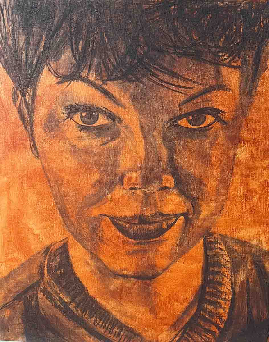
Imprimatura using Burnt Sienna and Burnt Umber
Applying Three Layers of Gesso
First Layer of Gesso
Purpose: Ensure proper adhesion to the surface; this layer should penetrate well. Method: Lightly sand or roughen the surface using very fine sandpaper (p240–p600), then wipe clean with a soft cloth. Apply gesso diluted with approx. 20% water using a wide flat brush.
Drying time: about 1 hour.
Second Layer of Gesso
Purpose: Build structure, improve coverage, and optionally introduce a first base tone. Method: Sand the first layer with fine sandpaper (wear a dust mask). Apply gesso diluted with approx. 10% water, or use undiluted gesso. You may mix in a small amount of matte acrylic paint (e.g., Red Ochre or Burnt Sienna) to tint the ground. Apply with a soft synthetic brush. The first layer may remain slightly visible beneath.
Drying time: about 1 hour.
Third Layer of Gesso
Purpose: Create the final surface texture—smooth or more lively—ensure full coverage, and optionally add a second tonal base.
Method: Apply undiluted gesso and work it up to a slightly “mousse-like” consistency. You may mix in a matte acrylic color, such as a muted grey (from umber, ivory black, and white), to establish a neutral ground. Don’t forget to coat the edges as well.
Drying time: about 1 hour. After drying, give the surface a light final sanding, wipe it clean, and you're ready for the next step. Below is an example of a toned ground (also called an imprimatura) using Burnt Umber and Burnt Sienna on linen.
A strong composition full of tension or harmony
Step 3: Composition & Color Strategy
Determining the Composition
Whether you are painting a commissioned portrait or creating a piece for yourself, you’ll need to make deliberate choices about composition. Composition refers to how the elements within your artwork are arranged. It determines how the viewer’s eye travels through the image and which areas draw the most attention.
Consider not only the size and placement of your subject, but also its orientation:
A head positioned straight-on conveys dignity and formality.
A slightly tilted head introduces dynamism and expression.
The size and placement of the subject have a direct impact on how the viewer engages with the portrait.
Straight
Tilted – Expressive
Small head – Wide gaze direction
Creating Tension or Harmony Through Color Strategy
Once you have established your composition, it’s time to consider how to bring it to life using color and value. Before you begin painting, decide whether you want your portrait to evoke tension, drama, calm, or harmony.
Your approach to color and tonal contrast will shape the emotional impact of the final work.
Your approach to color and tonal contrast will shape the emotional impact of the final work.
To help you get started:
Portrait with Contrasting Color Temperature
Working with warm/cool contrasts: Reds mixed with yellow appear warm and come forward. The same red mixed with blue will look cooler and recede. This is especially useful when defining facial contours.
Working with warm/cool contrasts: Reds mixed with yellow appear warm and come forward. The same red mixed with blue will look cooler and recede. This is especially useful when defining facial contours.
Portrait with Strong Value Structure
Starting from value contrast creates a powerful interplay between light and dark.
This can be achieved with white, grey, and black tones, but equally through color by emphasizing strong light–dark relationships.
Starting from value contrast creates a powerful interplay between light and dark.
This can be achieved with white, grey, and black tones, but equally through color by emphasizing strong light–dark relationships.
A Complementary Portrait
Introduce contrast using opposite colors on the color wheel, such as green versus red.
Introduce contrast using opposite colors on the color wheel, such as green versus red.
Accents in a Desaturated Portrait
A single saturated color element can create striking contrast within an otherwise muted, grey-toned (desaturated) environment.
A single saturated color element can create striking contrast within an otherwise muted, grey-toned (desaturated) environment.
A Harmonious Portrait
A palette of analogous or closely related colors, such as earth tones (umber, sienna, yellow ochre, black, white), brings calm and visual harmony to the work.
A palette of analogous or closely related colors, such as earth tones (umber, sienna, yellow ochre, black, white), brings calm and visual harmony to the work.
Starting Points for Color Approaches
Primary Color Contrasts
A painting built from red, blue, and yellow, each mixed with both warm and cool variants to expand the palette.
Primary Color Contrasts
A painting built from red, blue, and yellow, each mixed with both warm and cool variants to expand the palette.
Secondary Color Contrasts
A painting constructed using green, orange, and violet, again with both warm and cool variations mixed in for flexibility.
A painting constructed using green, orange, and violet, again with both warm and cool variations mixed in for flexibility.
CHOOSE THE METHOD THAT SUITS YOu
Step 4: Establishing the Initial Sketch
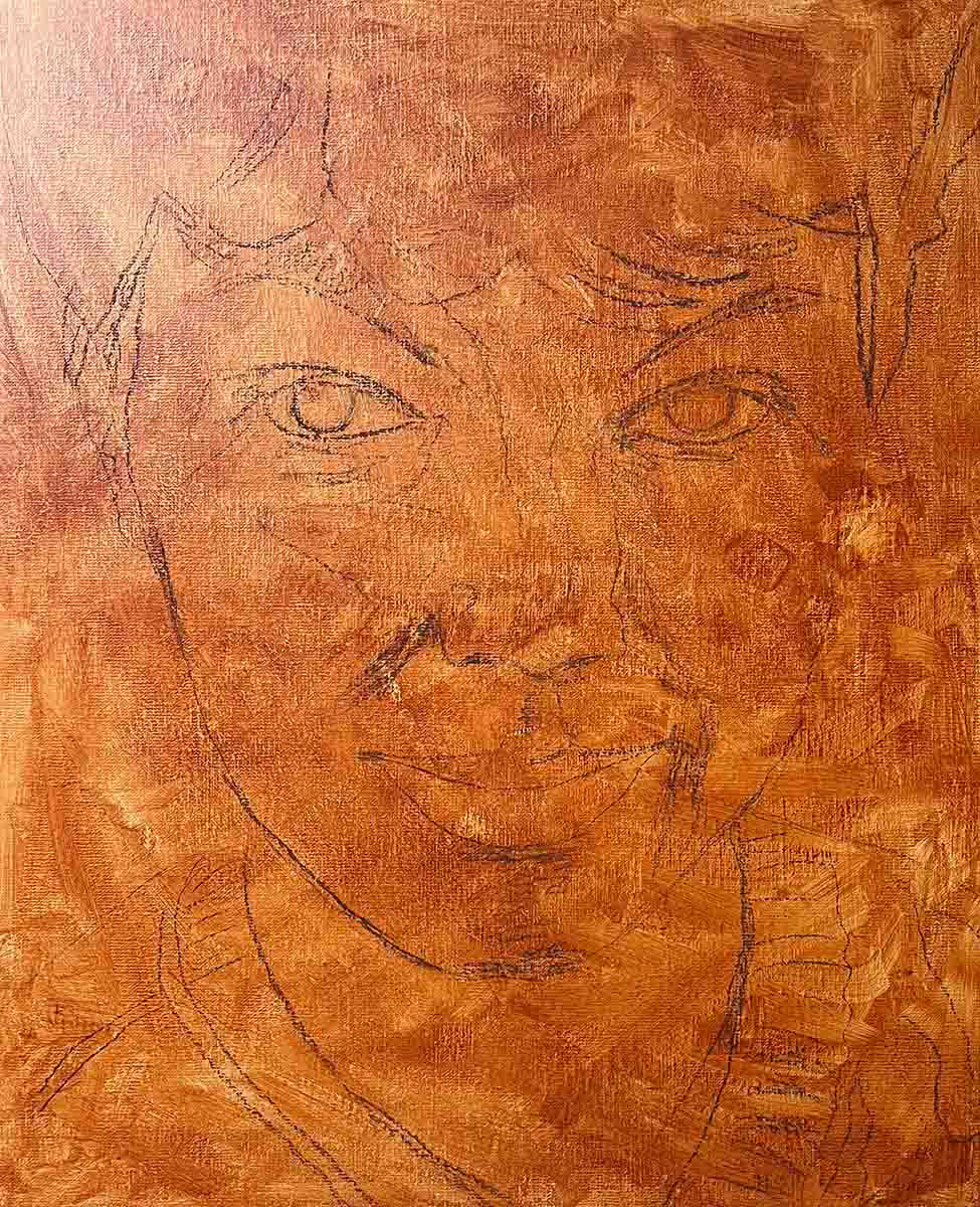
Depending on your level of observation and drawing experience, choose a method that allows you to transfer the likeness to the canvas as accurately as possible. Ideally, keep the sketch very light, using charcoal (remember to fix it afterward with a fixative spray to avoid issues during the grisaille cleaning stage!), graphite pencil, chalk, or by sketching directly with paint.
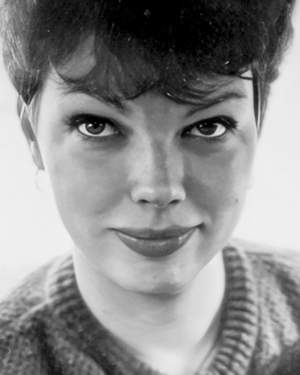
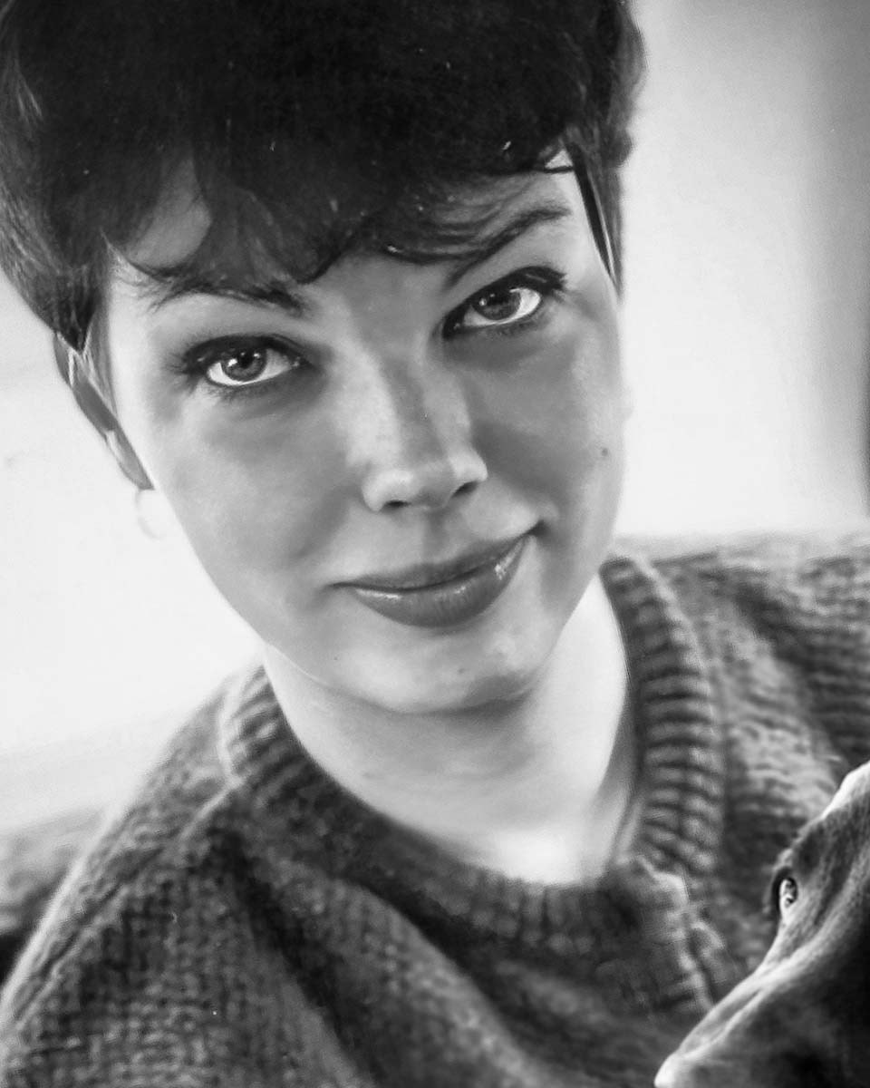
For portrait painting, having a basic understanding of facial anatomy is extremely helpful. Your approach will also differ depending on whether you’re working from a live model or from a reference image.
Portrait Painting with a Live Model
If you have the opportunity to work with a live model, it’s best to begin with a loose, open sketch using charcoal (or white/red chalk, avoid black) or thinned paint. Keep the drawing simple and avoid getting caught in details too early.
Use guiding lines to organise the placement of the eyes, nose, and mouth. The head is built from large structural volumes (forehead, nose, cheekbones, chin), with smaller forms embedded within them (nostrils, eye sockets, lips). Focusing on these primary masses first helps maintain proportion and character before refining features.
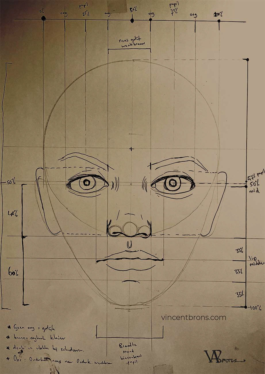
portretverhoudingen_gezicht
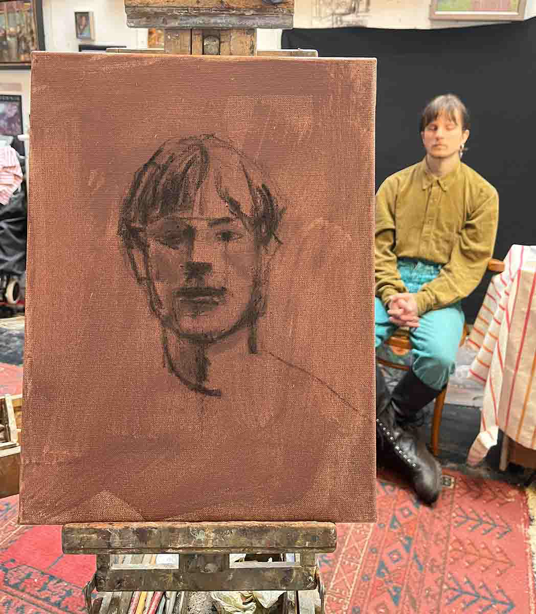
Eerste lijnen gezicht live model (houtskool)
Losse schets als basis
Portrait Painting from a Photo
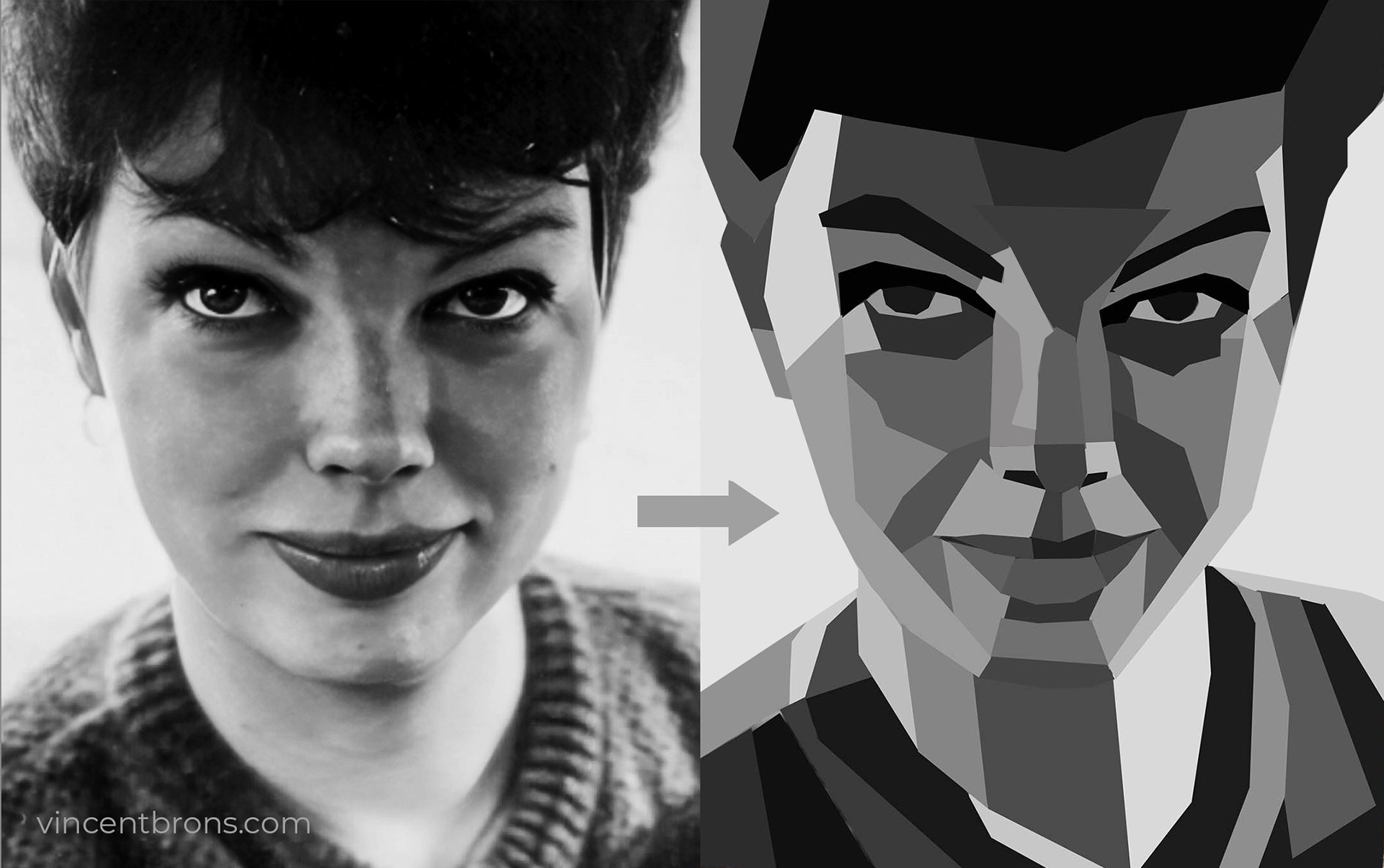
If you are working from an existing (digital) image such as a photograph, it can be helpful to apply a grid to the reference. You can then reproduce this grid on your own painting surface, giving you a clear structure for placing features accurately. By comparing each square, you know exactly what belongs where as you draw.
A similar approach is used when projecting the image onto the canvas with a projector. This allows you to transfer the entire composition before refining it with paint.
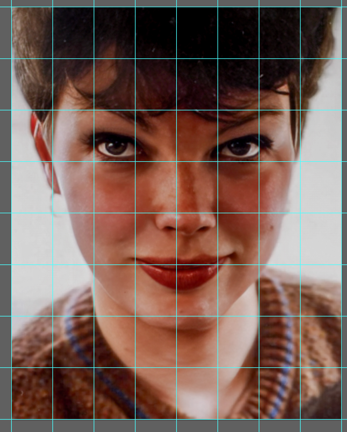
8 x 8 raster over de originele foto
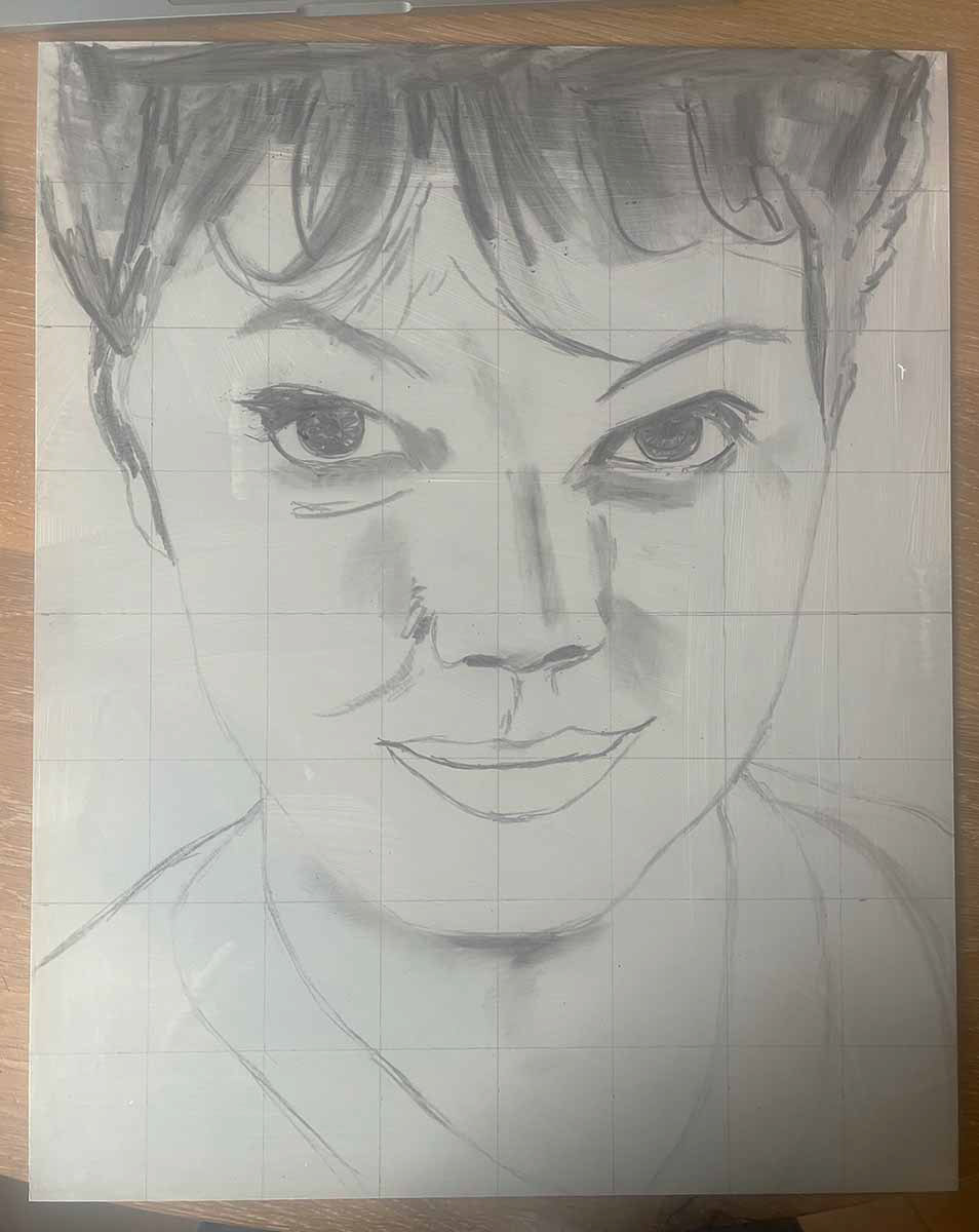
Begin vullen raster tekening
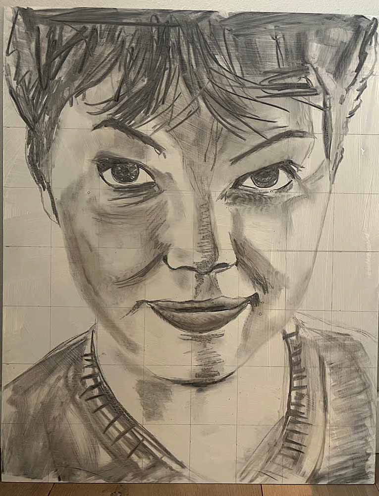
8 x 8 raster op een Alu panel uitgetekend
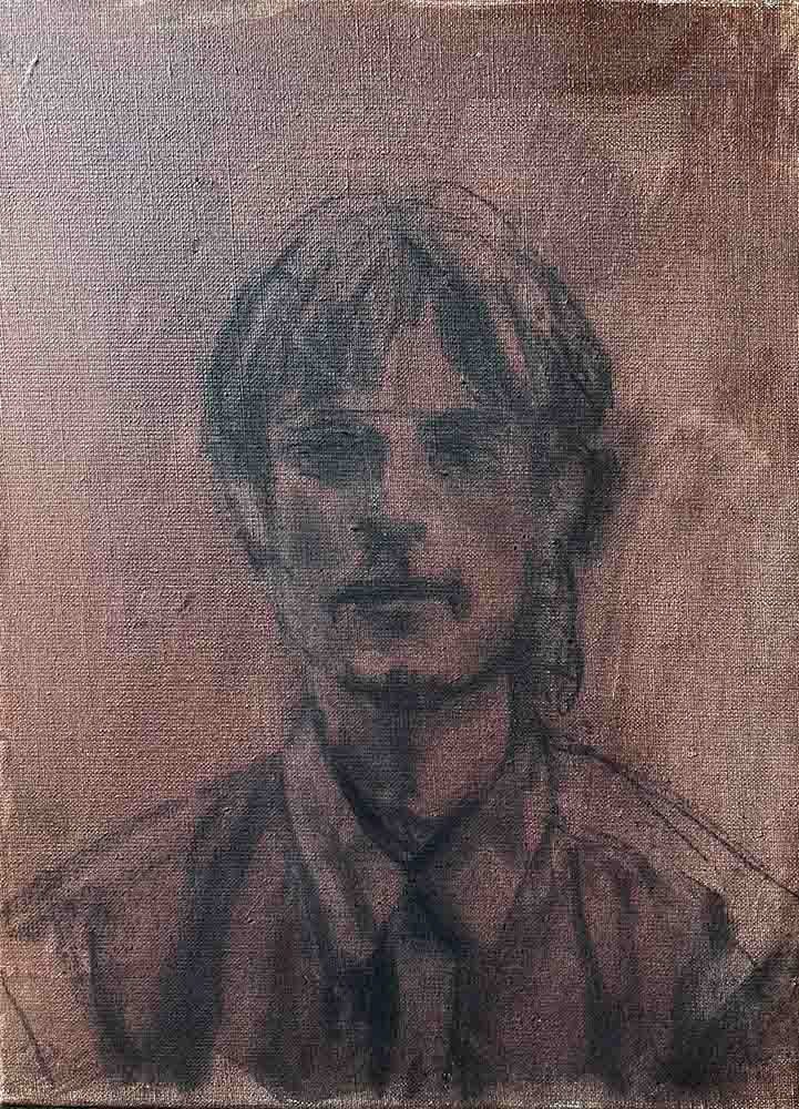
houtskool tekening op linnen
ESTABLISHING FORM AND COMPOSITION
Step 5: The Underpainting
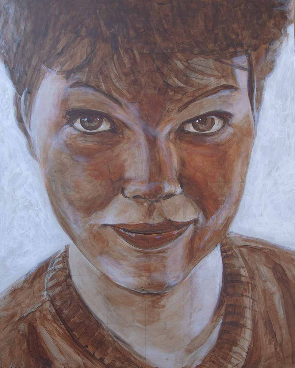
Your underpainting is the blueprint or skeleton of the painting. In this stage, you establish tonal harmony. This layer is often semi-transparent and applied thinly. Keep it lean, diluted sparingly with a small amount of water (or turpentine when using traditional oil paint). You work monochromatically, often using earthy tones such as burnt umber, focusing primarily on placement, proportions, tonal structure, and the larger forms. At this stage, the emphasis is on light and dark contrasts (values), not on colour.
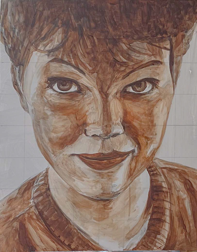
Underpainting with Burnt Umber on Dibond
Underpainting with Burnt Umber on linen
Materials and Technique
Dilute Burnt (or Raw) Umber sparingly with a small amount of water (or turpentine when using traditional oil paint). You may choose to thin the paint further with a thinner at this stage, but this is less common due to drying time. A touch of Yellow or Orange Ochre can add warmth, as can Burnt Sienna in the more reddish areas but this is not yet essential.
Pay close attention to the transitions between lit and shadowed areas. Some transitions will be hard, others soft. Avoid working too dark at this stage.
Second Phase of the Underpainting: Cleaning
Make sure the underpainting is fully dry. To ensure proper adhesion of subsequent layers and to remove any remaining charcoal residue, first clean your canvas or panel.
Mix in a small container:
1 part ammonia to 5 parts water. Use a cotton cloth (for example, from an old T-shirt), lightly moisten it with the mixture, and gently wipe the surface clean. Allow it to dry for 5–10 minutes. If you find that certain dark areas need to be reworked because charcoal was still influencing the tone, this is the right moment to adjust them.
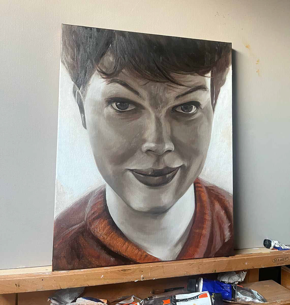
A MONOCHROME UNDERPAINTING IN VALUES
Step 6: Light and Dead Colour (Grisaille)
What is Dead Colour (Grisaille)?
Dead colour is a technique in which you work monochromatically in white, grey, or brown tones to establish the distribution of light and dark before introducing colour. This helps create a solid foundation for the final colour and tonal contrasts. Goal: to form an initial impression of volume, light direction, and atmosphere.
Dead colour is a technique in which you work monochromatically in white, grey, or brown tones to establish the distribution of light and dark before introducing colour. This helps create a solid foundation for the final colour and tonal contrasts. Goal: to form an initial impression of volume, light direction, and atmosphere.
You apply light accents to the correct planes (such as the forehead, bridge of the nose, and cheekbones). Think of the model in terms of planes by simplifying rounded forms, and study how light behaves across them observing how the face is illuminated as if it were a sculpture.
Example of a face, simplified into planar structures.
The dead-colour layer is still relatively restrained, but slightly richer than the underpainting. Work in thin layers so the underpainting subtly shows through. You may already introduce small amounts of light flesh tones or subtle colour notes.
This stage gives a somewhat “dead” appearance because it looks flat, pale, and unrefined.
This stage gives a somewhat “dead” appearance because it looks flat, pale, and unrefined.
Light
Through careful observation, determine how light moves across the face:
Rounded forms (such as the cheek or chin) → soft, flowing transitions
Angular structures (such as the nose or jawline) → stronger contrast between light and dark
Use a synthetic filbert brush (size 8) to create smooth transitions.
Tip: light areas do not always require white paint; often it is enough to strengthen the surrounding tones and shadows. In short—observe carefully.
Tip: light areas do not always require white paint; often it is enough to strengthen the surrounding tones and shadows. In short—observe carefully.
Shadow
Deep shadows (background and darkest areas) → thin, transparent layers of burnt umber and/or ivory black
Lighter shadows (transition zones such as cheeks, jawline, and neck) → apply a very thin layer of umber and black rather than working directly with white
Use a broader brush for larger shadow masses and a smaller, round brush for subtle shadow transitions.
In the eye sockets, under the nose, and beneath the chin, you may already introduce warmer tones to suggest the typically warm reflected light from the surroundings.
In the eye sockets, under the nose, and beneath the chin, you may already introduce warmer tones to suggest the typically warm reflected light from the surroundings.
A MOMENT OF CHOICE
Two options for creating your grisaille
t this stage, you introduce stronger contrast and form by building up the lighter areas of the painting. Use little to no dilution—you want to work fatter than in the previous (thinned) layer.
Work with either a narrow or broader round brush to preserve the forms and avoid getting lost in details too early.
Work with either a narrow or broader round brush to preserve the forms and avoid getting lost in details too early.
Begin with thin layers of white and gradually apply thicker white paint in areas receiving the strongest light. Thin layers create subtle illumination; thicker paint adds volume and emphasis to the lit planes. Use a slightly damp cloth or a dry brush to soften transitions. Before you begin, however, you must make a choice…
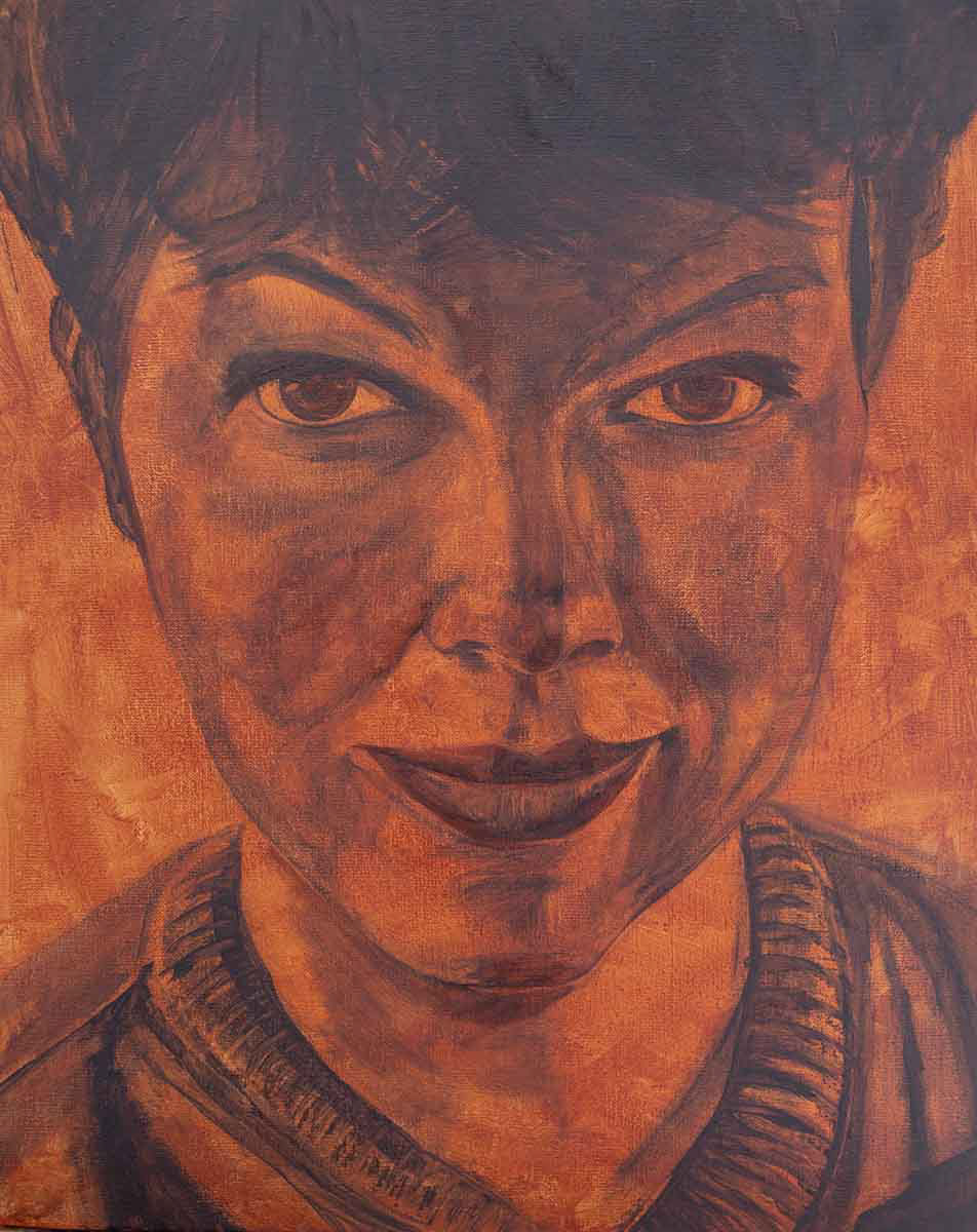
OPTION 1: GRISAILLE BASED ON LIGHT ZONES
This method is rooted in chiaroscuro (light–dark contrast). Using titanium white—optionally mixed with a small amount of umber or grey—you gradually build up the lighter zones in transparent or opaque layers.
The shadow areas are largely left untouched; the darkness of the imprimatura already establishes the shadow masses.
The shadow areas are largely left untouched; the darkness of the imprimatura already establishes the shadow masses.
Materials: Titanium white (optionally mixed with Yellow or Orange Ochre to introduce warmth)
Grisaille with Titanium White over a Burnt Umber underpainting
OPTION 2: GRISAILLE INCLUDING SHADOWS
This approach is more systematic. You typically use titanium white and Van Dyck brown (or ivory black) to mix a range of tonal values (for example: white, light grey, mid-grey, and dark grey/black).
With these mixtures, you paint the entire portrait or figure including shadows and halftones much like a black-and-white photograph.
With these mixtures, you paint the entire portrait or figure including shadows and halftones much like a black-and-white photograph.
Materials: Titanium white (optionally mixed with Yellow Ochre to introduce warmth) Van Dyck brown or ivory black (optionally mixed with raw or burnt umber for warmth, or ultramarine for cooler tones)
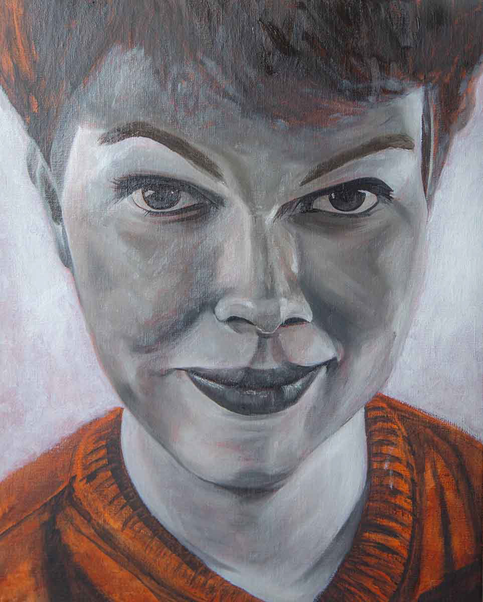
Grisaille with four tones between Titanium White and Ivory Black
Second grisaille pass, refining details further
Final phase of the grisaille
THE GRISAILLE COMES TO LIFE
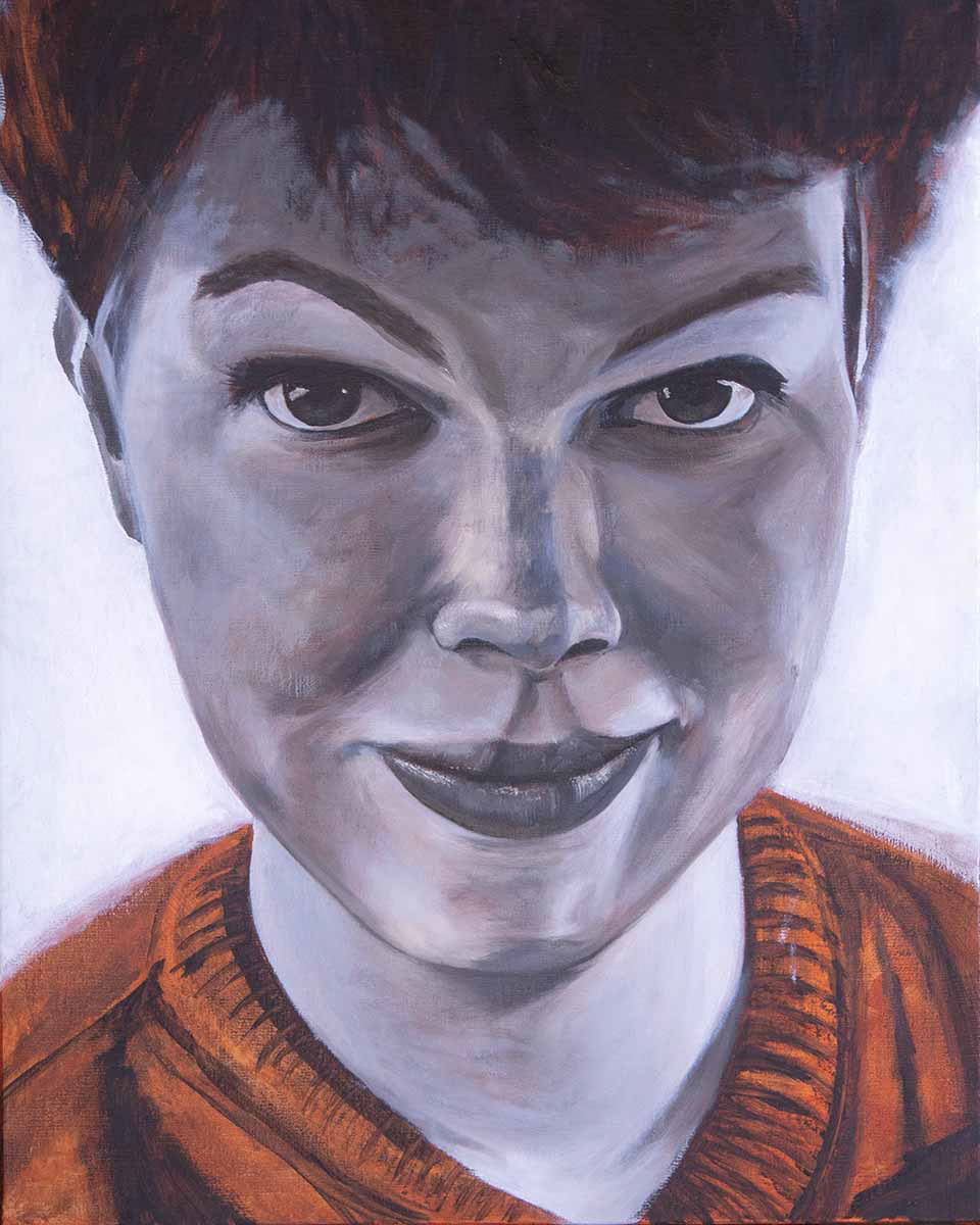
Step 7: Colour
Make sure the grisaille is completely dry before continuing. This usually takes between five days and one and a half weeks especially thicker white passages tend to dry slowly. If the paint is still wet, colours may unintentionally mix or the paint layer may crack later on.
At this stage, you work with subtle colour nuances and keep your palette restrained. We no longer thin the paint with water or turpentine. Colour is built up in lean, thin, transparent layers, using only a small amount of medium, so the grisaille remains visible and effective beneath the paint.
I experienced working with Cobra water mixable oil paint + mediums
Why we work with Mediums
From this stage onward, you begin using painting mediums to give your paint more character. A medium is used to make paint more fluid, more transparent, or richer and fatter, depending on the effect you want to achieve. Without a medium, paint is opaque and stiff (straight from the tube).
With a medium, paint becomes smoother, richer, and deeper in colour.
With a medium, paint becomes smoother, richer, and deeper in colour.
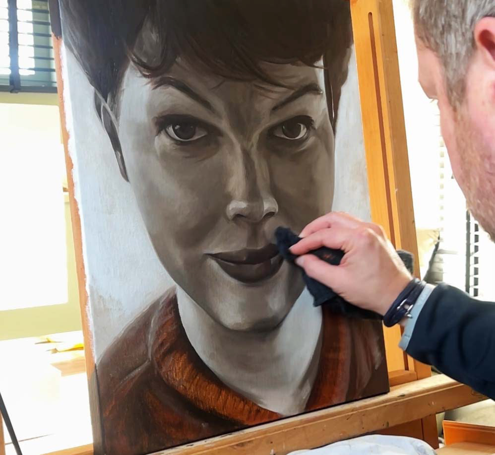
Phase 1: Cleaning and Refreshing the Grisaille
To ensure proper adhesion, first clean your canvas or panel.
Mix in a small container: 1 part ammonia to 5 parts water. Use a cotton cloth (for example, from an old T-shirt), lightly moisten it with the mixture, and gently wipe the surface clean.
Allow it to dry for 5–10 minutes.
Mix in a small container: 1 part ammonia to 5 parts water. Use a cotton cloth (for example, from an old T-shirt), lightly moisten it with the mixture, and gently wipe the surface clean.
Allow it to dry for 5–10 minutes.
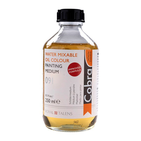
Optional – ‘Oiling Out’
Oiling-Out
If your grisaille appears dull or matte, apply a few drops of Cobra Painting Medium or Solvent-Free Medium. Spread it very thinly using a soft cloth or a flat brush, especially over the darker areas, to bring them forward slightly. Allow it to absorb briefly (max. 1–2 minutes). Blot or wipe away any excess medium; the surface should not feel wet or tacky. Your painting surface will now feel silky smooth, and you can continue painting immediately.
Phase 2: Transparent Colour Veils Using Unmixed Colours
Now we begin working with colour. In this phase, colour is applied without mixing it with other colours. On the canvas, colours are placed next to each other so they blend optically rather than physically on the palette.
We use a limited selection of (semi-)transparent paints in their pure form. The symbols on the paint tubes indicate the type of paint:
We use a limited selection of (semi-)transparent paints in their pure form. The symbols on the paint tubes indicate the type of paint:
□ = Transparent paint
◫ = Semi-transparent paint
◪ = Semi-opaque paint
■ = Opaque paint
◫ = Semi-transparent paint
◪ = Semi-opaque paint
■ = Opaque paint
It is perfectly fine if colour contrasts appear somewhat exaggerated at this stage; they will be softened in a later phase. Take your time, work extremely thin, and do not aim to cover everything yet. Allow the grey tones of the grisaille to show through intentionally.
At this stage, you are merely laying a first, subtle veil of colour over the grisaille.
At this stage, you are merely laying a first, subtle veil of colour over the grisaille.
Materials
Brushes
Use a soft, round synthetic brush (size 4–8) for smaller areas, and a soft synthetic filbert brush for larger zones.
Brushes
Use a soft, round synthetic brush (size 4–8) for smaller areas, and a soft synthetic filbert brush for larger zones.
Colors
Transparent and Semi-Transparent Colours (no white)
Transparent and Semi-Transparent Colours (no white)
□ 419 Red Ochre +++
□ 265 Transparent Oxide Yellow +++
◫ 411 Burnt Sienna +++
◫ 389 Alizarin Crimson +++
□ 504 Ultramarine Blue +++
◫ 409 Burnt Umber +++
◫ 408 Raw Umber +++
□ 265 Transparent Oxide Yellow +++
◫ 411 Burnt Sienna +++
◫ 389 Alizarin Crimson +++
□ 504 Ultramarine Blue +++
◫ 409 Burnt Umber +++
◫ 408 Raw Umber +++
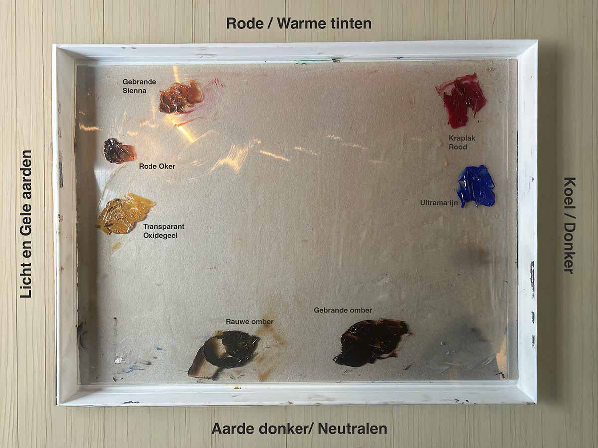
Arrangement of colors on the palette in phase 2 of portrait painting
Mixing Medium with Your Paint
We begin with Cobra Painting Medium 091. This increases flow and makes the paint richer and fatter. With just a few drops, it enhances transparency, increases gloss, and softens brushstrokes. When using a medium, be sure to clean your brushes thoroughly afterward, reshape the bristles, and allow them to dry flat or upright.
Add a small amount of medium in drops to the separate piles of paint on your palette. This can be done using a pipette, or by dipping the back of your brush into the medium and letting it drip next to the paint on the palette. Start with 10–20% medium relative to the paint. Often, a single drop next to your paint is sufficient. Check as you go.
Too little medium?
→ little effect, faster drying, reduced flow. Mix the medium into the paint with a palette knife until homogeneous.
→ little effect, faster drying, reduced flow. Mix the medium into the paint with a palette knife until homogeneous.
Too much medium?
→ the paint becomes thin, overly transparent, and difficult to control.
→ the paint becomes thin, overly transparent, and difficult to control.
You should aim for an even consistency that is slightly more fluid than paint straight from the tube. You will notice the paint becoming a bit smoother and glossier, while still remaining controllable. Test your mixture on a scrap piece of canvas, canvas paper, or panel. Check whether it spreads pleasantly, is not too watery, and achieves the desired coverage. It is better to start with too little medium than too much, you can always add more later.
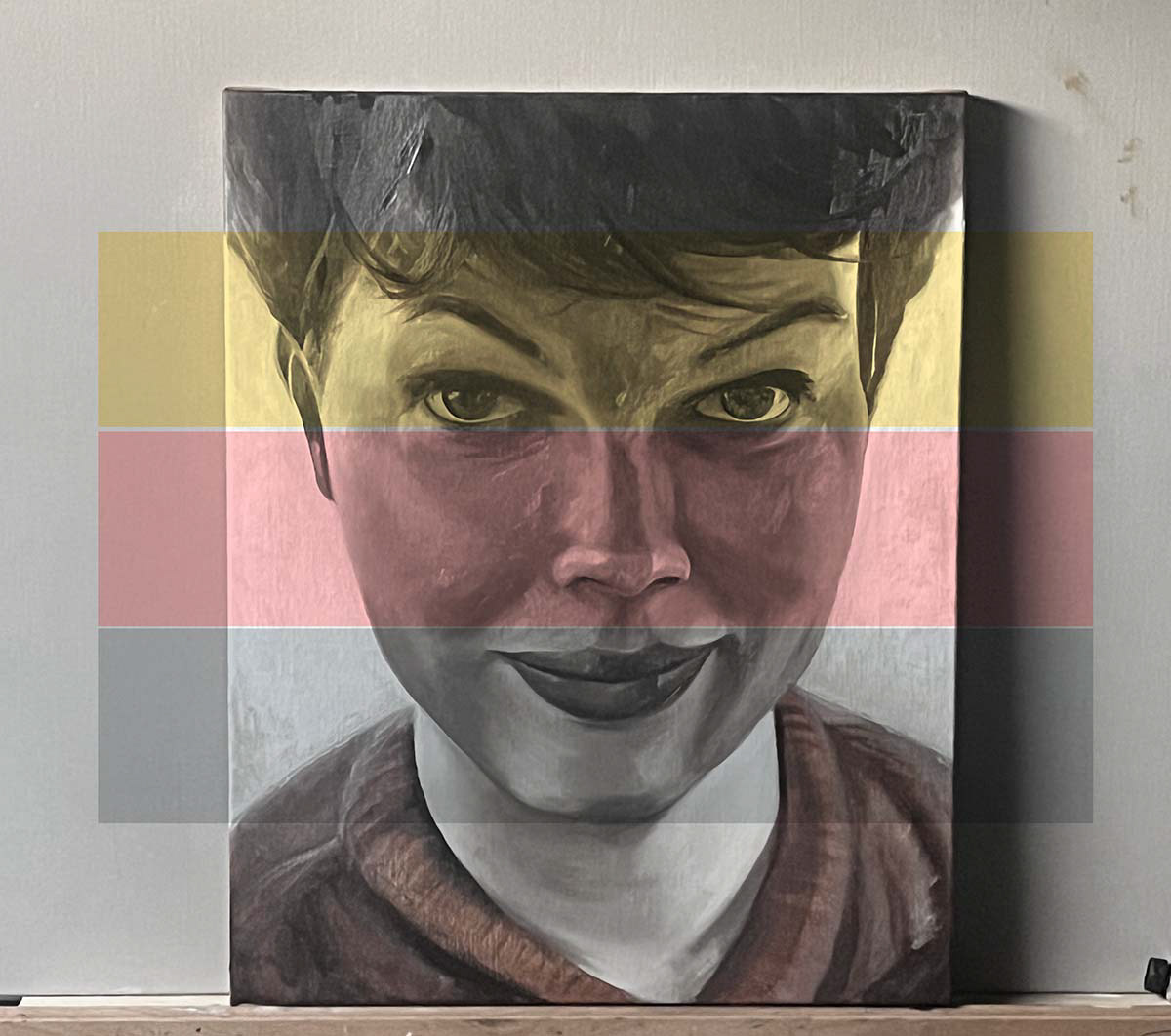
Color zones in the face
Colour zones in the face
In general, the face can be divided into three colour zones.
The upper zone (forehead), which contains fewer blood vessels, tends to appear more yellow in tone. The middle zone, with a higher concentration of blood vessels (nose, cheeks, ears), appears more reddish or pink.
The lower zone, where the skin is thicker and blood flow is less visible (chin, jawline, neck), tends to be cooler, often greyer, greenish, or bluish in tone. In men, beard growth can further accentuate this effect.
Approach and Order
1. Shadows
Begin with the darker zones, as they immediately establish form and depth: Burnt umber for deep shadows (eye sockets, sides of the nose, jawline) Raw umber for softer, cooler shadow areas (neck, cheeks beneath the cheekbones) Starting this way allows the plasticity of the face to emerge quickly and prevents lighter colours from flattening the form.
Begin with the darker zones, as they immediately establish form and depth: Burnt umber for deep shadows (eye sockets, sides of the nose, jawline) Raw umber for softer, cooler shadow areas (neck, cheeks beneath the cheekbones) Starting this way allows the plasticity of the face to emerge quickly and prevents lighter colours from flattening the form.
2. Cool Reflections
Apply ultramarine sparingly in cooler shadow areas (depending on the light source, often under the chin, along the sides of the forehead, or near the jawline). This enhances the illusion of space and surrounding environment. Ultramarine can also be explored in darker areas of the hair.
Apply ultramarine sparingly in cooler shadow areas (depending on the light source, often under the chin, along the sides of the forehead, or near the jawline). This enhances the illusion of space and surrounding environment. Ultramarine can also be explored in darker areas of the hair.
3. General Skin Colour Veil
Now lay a soft, warm base over the skin areas: Transparent Oxide Yellow over the forehead, bridge of the nose, temples, and cheeks (the larger light zones) Burnt Sienna if you wish to introduce additional warmth in areas such as the eyelids, nostrils, or ears
Now lay a soft, warm base over the skin areas: Transparent Oxide Yellow over the forehead, bridge of the nose, temples, and cheeks (the larger light zones) Burnt Sienna if you wish to introduce additional warmth in areas such as the eyelids, nostrils, or ears
4. Warm Accents / Blush
Finally, apply subtle accents: Alizarin Crimson and optionally a touch of Red Ochre on the cheeks, nostrils, chin, and lip contours. Apply these only at the very end and with restraint, as this is the most assertive colour and can quickly become too intense.
Finally, apply subtle accents: Alizarin Crimson and optionally a touch of Red Ochre on the cheeks, nostrils, chin, and lip contours. Apply these only at the very end and with restraint, as this is the most assertive colour and can quickly become too intense.
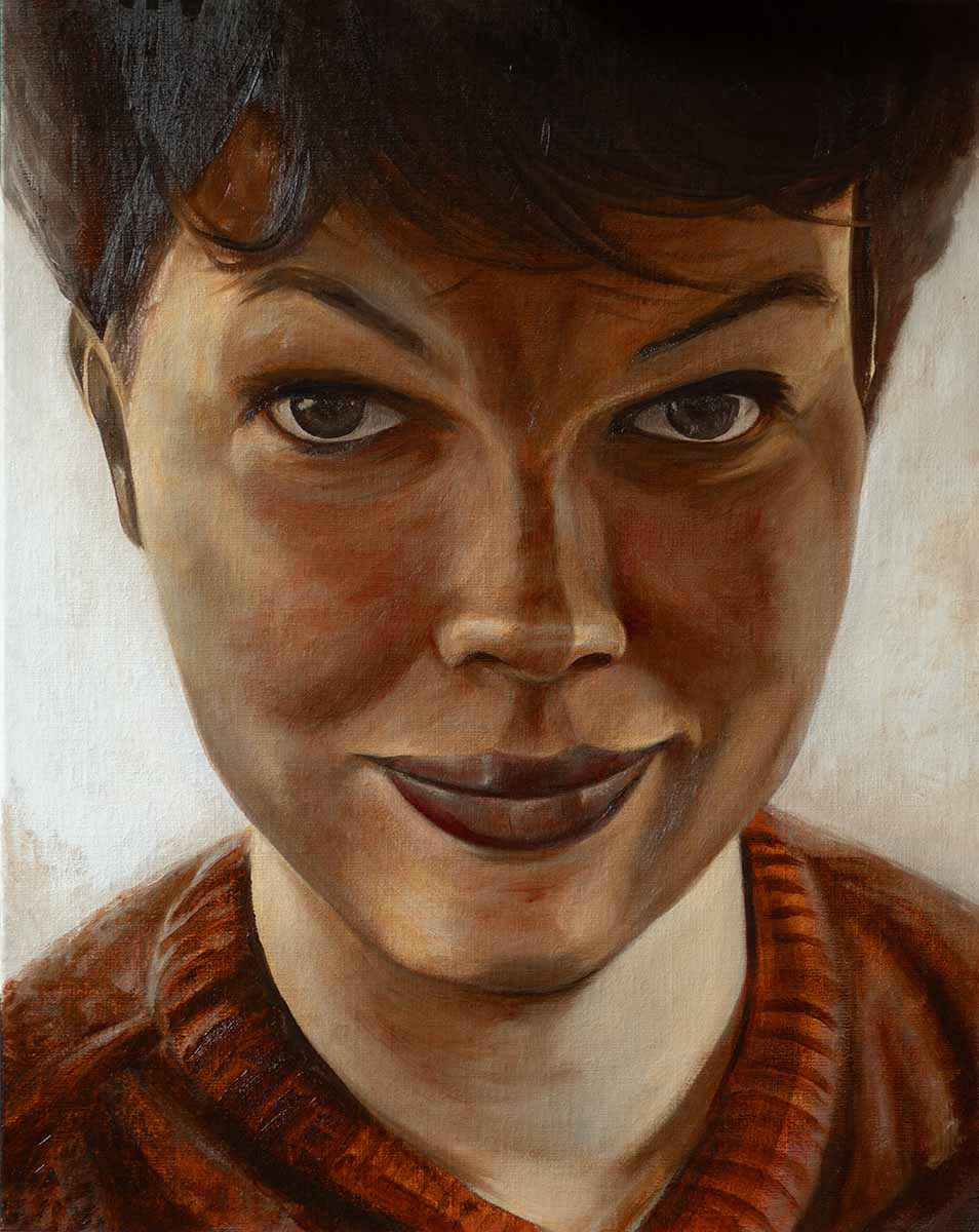
Result of Phase 2: Transparent Colour Veils with Unmixed Colours
Phase 3: Colour Modelling with Mixed Colours
In this phase, you introduce white into your colours for the first time and begin mixing flesh tones on the palette. You also start thinking more consciously in terms of warm and cool zones within the face.
The mixed colours are applied to the canvas using smaller, more subtle brushstrokes.
The mixed colours are applied to the canvas using smaller, more subtle brushstrokes.
Dark colours are often more transparent than light ones, so begin with transparent dark colours. Avoid using black or brown as default shadow colours; instead, explore dark reds or dark blues.
Place colours next to each other on the canvas and gently blend them together in certain areas. After this, move on to the more opaque light areas by mixing your colours with opaque titanium white and/or yellow ochre.
Place colours next to each other on the canvas and gently blend them together in certain areas. After this, move on to the more opaque light areas by mixing your colours with opaque titanium white and/or yellow ochre.
Materials
Brushes
Brushes
Use a soft, round synthetic brush (size 4–8) for smaller areas, and a soft synthetic filbert brush for larger zones.
Colours
■ 303 Cadmium Red (Light) +++
◫ 389 Alizarin Crimson +++
□ 419 Red Ochre +++
◫ 411 Burnt Sienna +++
◫ 409 Burnt Umber +++
◪ 403 Van Dyck Brown +++
□ 265 Transparent Oxide Yellow +++
■ 227 Yellow Ochre +++
■ 105 Titanium White (no zinc white) +++
■ 701 Ivory Black (Bone Black) +++
◪ 311 Vermilion +++ (optional, for extra warmth)
□ 504 Ultramarine Blue +++
◫ 408 Raw Umber +++
Medium
Cobra Painting Medium 091
(Used more generously at this stage: approximately 1 part medium to 3 parts paint)
Cobra Painting Medium 091
(Used more generously at this stage: approximately 1 part medium to 3 parts paint)
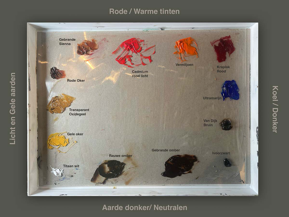
Arranging Colours on Your Palette for Phase 3
ixing Colours per Zone
Forehead
Base: Transparent Oxide Yellow + Yellow Ochre
Accent: A knife-tip of Alizarin Crimson for a rosy undertone
Light: Mix with Titanium White for the higher planes of the forehead
To cool down: add a small touch of Ultramarine
Forehead
Base: Transparent Oxide Yellow + Yellow Ochre
Accent: A knife-tip of Alizarin Crimson for a rosy undertone
Light: Mix with Titanium White for the higher planes of the forehead
To cool down: add a small touch of Ultramarine
Nose
Base: Burnt Sienna + Alizarin Crimson + white
Shadow: Burnt Umber + a small amount of Ivory Black
Highlight: Titanium White + Yellow Ochre
Cheeks and Bridge of the Nose (between the eyes)
Mix: 2 parts Red Ochre + 1 part Transparent Oxide Yellow
Creates a warm blush—use sparingly and allow it to transition softly. For lighter areas, subtly mix with Titanium White or Yellow Ochre.
Cheekbones
Warm: Red Ochre + Vermilion + white
Cool alternative: Ultramarine instead of Vermilion
Accent: Alizarin Crimson very sparingly for translucent undertones
Warm: Red Ochre + Vermilion + white
Cool alternative: Ultramarine instead of Vermilion
Accent: Alizarin Crimson very sparingly for translucent undertones
Lips
Dark areas: Alizarin Crimson + Burnt Umber
Warm depth: Red Ochre + Burnt Sienna
Light: add white for the lower lip
Warm accent: Vermilion + Yellow Ochre
Dark areas: Alizarin Crimson + Burnt Umber
Warm depth: Red Ochre + Burnt Sienna
Light: add white for the lower lip
Warm accent: Vermilion + Yellow Ochre
Chin and Jaw
Base: Burnt Umber + Yellow Ochre + white
Cool: add Ultramarine or Ivory Black
Base: Burnt Umber + Yellow Ochre + white
Cool: add Ultramarine or Ivory Black
Eyebrows and Hairline
Mix: 2 parts Burnt Sienna + 1 part Ultramarine
Creates an earthy, warm grey for natural shadows, also suitable for the temples and hairline. Raw Umber may be used for more subtle shadow passages.
Subtle Cool Shadows (eye sockets, chin, temples)
Mix: 2 parts Transparent Oxide Yellow + 1 part Ultramarine, mixed with medium produces an olive-green tone suitable for the underside of the jaw, neck shadows, inner eye sockets, and temples.
Neutral Shadow (underside of the jaw and neck)
Mix: 1 part Ultramarine + 1 part Burnt Sienna
Creates a neutral, cool shadow with depth, without becoming dull. Raw Umber can be added for subtle shadow variations. For deep, cool shadows, you can also use Van Dyck Brown, for example in the hairline, under the chin, or in the background. It is transparent and rich, making it well suited for building subtle depth without suffocating the painting’s clarity.
Optional: Quick Drying Medium
Allow this layer to dry; this may take several days up to a week, depending on the colours used and the amount of medium.
You may optionally mix a Quick Drying Medium into the paint to speed up drying time and increase transparency. Use sparingly, too much will turn the paint into a greasy sauce.
You may optionally mix a Quick Drying Medium into the paint to speed up drying time and increase transparency. Use sparingly, too much will turn the paint into a greasy sauce.
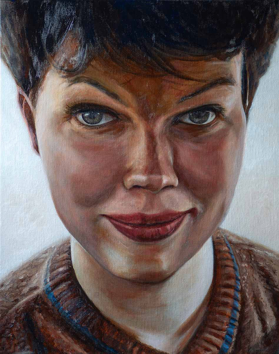
Result of phase 3: greater nuance in tonal values and color, using mixed colors
Phase 4: Glazing (Darker and More Vibrant Effect)
Glazing involves applying a thin, transparent layer over a dry underlying layer. This deepens colours and increases contrast. Colours that previously appeared matte or dull become richer and more vibrant, while warm colours intensify and cooler tones gain luminosity. A glaze darkens the underlying layer, whereas scumbling (Phase 5, following) has the opposite effect and lightens it.
Work in multiple thin layers for the greatest sense of depth, and allow each layer to dry completely before applying the next glaze. You can safely apply several glaze colours in different areas on the same day, as long as you do not work over the same area repeatedly. Drying time ranges from 1 day (thin, moderately lean layers) to 5 days (thicker, richer layers).
When continuing after the first colour phase, the paint surface is often dry and uneven. At this point, applying the oiling-out principle can again be helpful. Apply a few drops of Cobra Painting Medium or Solvent-Free Medium, spreading it very thinly with a soft cloth or flat brush. Allow it to absorb briefly (max. 1–2 minutes), then blot or wipe away any excess, the surface should not feel wet or tacky. Your surface will now feel silky smooth, and you can continue painting immediately.
Materials for Glazing
Brushes
Use a soft, round synthetic brush (size 4–8) for smaller areas, and a soft synthetic filbert brush for larger zones.
Brushes
Use a soft, round synthetic brush (size 4–8) for smaller areas, and a soft synthetic filbert brush for larger zones.
Transparent and Semi-Transparent Colours
◫ 411 Burnt Sienna +++
□ 265 Transparent Oxide Yellow +++
□ 504 Ultramarine Blue +++
◫ 389 Alizarin Crimson +++
◫ 409 Burnt Umber +++
◫ 408 Raw Umber +++
◫ 411 Burnt Sienna +++
□ 265 Transparent Oxide Yellow +++
□ 504 Ultramarine Blue +++
◫ 389 Alizarin Crimson +++
◫ 409 Burnt Umber +++
◫ 408 Raw Umber +++
Medium
This time, use Cobra Glazing Medium 092 (high oil content, very fluid and glossy). Mix in a 1:1 ratio, or even use slightly more medium than paint.
Result of Phase 4: Greater Depth and Intensity in the Dark Areas
Advice
Wait approximately 5–7 days before proceeding to the next phase—scumbling—especially if a 1:1 ratio was used and the glaze layer was not extremely thin. The glaze must be fully dry before continuing.
Phase 5: Scumbling (Lightening and Softening)
What is scumbling?
Scumbling creates essentially the opposite effect of glazing. It involves applying a dry, semi-opaque or opaque lighter paint layer over a dark, dry underlayer. Unlike glazing, which relies on transparency, scumbling is intended to lighten and soften areas of your painting.
The result is often a hazy, diffused effect, as if a veil lies over the underlying paint.
Scumbling works best with a stiff, dry brush—or even with your finger or a cloth—gently rubbing the paint across the surface. This allows the relief and texture of the underlayer to remain visible, creating a lively, atmospheric layering.
Use lighter colours and make sure the paint is not too wet—the strength of scumbling lies in its subtle, dry application.
Use lighter colours and make sure the paint is not too wet—the strength of scumbling lies in its subtle, dry application.
Materials for Scumbling
Brushes
Use stiff brushes (flat or round, size 4–10).
Old, slightly worn brushes are especially suitable, as they hold less paint and create more texture. Optionally, a sponge, cloth, or your finger can be used for soft transitions or smudging.
Brushes
Use stiff brushes (flat or round, size 4–10).
Old, slightly worn brushes are especially suitable, as they hold less paint and create more texture. Optionally, a sponge, cloth, or your finger can be used for soft transitions or smudging.
Colours Suitable for Scumbling in Portrait Painting
Prefer lighter, semi-opaque to opaque colours for lifting forms, such as:
Prefer lighter, semi-opaque to opaque colours for lifting forms, such as:
■ 105 Titanium White +++ (no zinc white)
■ 222 Naples Yellow Light +++
■ 228 Yellow Ochre Light +++
◪ 522 Cobalt Blue (Ultramarine) +++
□ 419 Transparent Red Ochre +++
■ 222 Naples Yellow Light +++
■ 228 Yellow Ochre Light +++
◪ 522 Cobalt Blue (Ultramarine) +++
□ 419 Transparent Red Ochre +++
Medium
Use little to no medium. You want a dry touch, so at most mix in a very small amount of a lean medium, or work straight from the tube. All scumbles consist of minimal pigment and plenty of white—you are always lightening, never darkening.
Allow these layers to dry thoroughly before continuing with any new glazing or opaque paint.
Mixing Three Colours for Scumbling
1. Warm Light Mixture
1. Warm Light Mixture
A soft ivory-like warm skin light, perfect for softening darker glazes.
Use on cheeks, chin, and nostrils.
Use on cheeks, chin, and nostrils.
70% Titanium White
20% Naples Yellow Light
8% Yellow Ochre Light
2% Red Ochre 419 (optional—can be omitted)
20% Naples Yellow Light
8% Yellow Ochre Light
2% Red Ochre 419 (optional—can be omitted)
2. Neutral Light Mixture
The safest, most controllable mixture. Use on the bridge of the nose, central forehead, and philtrum (the vertical groove between nose and upper lip).
80% Titanium White
15% Naples Yellow Light
5% Yellow Ochre Light
3. Cool Light Mixture
A very light mixture with only a trace of cobalt blue. This cools the light slightly—not to create shadow. Use along the jawline, hairline, and temples.
15% Naples Yellow Light
5% Yellow Ochre Light
3. Cool Light Mixture
A very light mixture with only a trace of cobalt blue. This cools the light slightly—not to create shadow. Use along the jawline, hairline, and temples.
85% Titanium White
10% Naples Yellow Light
3% Cobalt (Ultramarine)
2% Yellow Ochre Light
10% Naples Yellow Light
3% Cobalt (Ultramarine)
2% Yellow Ochre Light
Scumbling phase completed, with the lighter areas subtly reinforced and lifted
THE FINAL STAGE OF YOUR CLASSICAL PORTRAIT
Step 8: Accents and Finishing Touches
This is where feeling and finesse come into play, trust your painter’s hand. Rembrandt did not necessarily aim for perfectly smooth surfaces; visible brushstrokes and areas of relief created with thick paint (impasto) are very much allowed. By softening certain areas while sharpening others, you can enhance depth and perspective. Alternate loose, expressive brushwork with precise details to create a dynamic and lively painting.
Express yourself thoughtfully
Correct mistakes by removing paint with a palette knife, finger, or cloth. Painting is sometimes just as much about taking paint away as it is about applying it. In the final stage, add a few subtle contrasts to create visual tension, such as thick paint (white or yellow) for a highlight, like the glimmer on a pearl. But don’t overdo it.
Once a thick impasto layer is dry, you can glaze over it with a transparent colour, such as a light yellow. Think of the sleeve in The Jewish Bride by Rembrandt. Other areas of the painting should remain more fluid and less impasto-heavy. This contrast is what gives the work its vitality. Vary between rough and smooth passages, refined and coarse areas placed side by side. You can even scratch into wet paint with the back of your brush to suggest fine highlights, such as strands of hair.
Brushes
Precise details – round or fine synthetic brush
Loose strokes – filbert or flat brush (with spring)
Applying impasto – hog bristle brush or palette knife
Scratches / lines – back of the brush or brush handle
Wiping / correcting – cloth or finger
Precise details – round or fine synthetic brush
Loose strokes – filbert or flat brush (with spring)
Applying impasto – hog bristle brush or palette knife
Scratches / lines – back of the brush or brush handle
Wiping / correcting – cloth or finger
Colours
■ 222 Naples Yellow Light +++
■ 105 Titanium White (no zinc white) +++
□ 504 Ultramarine Blue +++ (micro-dosage for cooling)
◪ 403 Van Dyck Brown +++
■ 228 Yellow Ochre Light +++
■ 222 Naples Yellow Light +++
■ 105 Titanium White (no zinc white) +++
□ 504 Ultramarine Blue +++ (micro-dosage for cooling)
◪ 403 Van Dyck Brown +++
■ 228 Yellow Ochre Light +++
Medium
Avoid water; use only oil-compatible mediums.
For an impasto effect, a technique in which paint is applied thickly to the canvas, creating a three-dimensional, tactile surface with visible brush or palette knife marks that add depth, movement, and vitality, work straight from the tube, optionally mixed with Cobra Painting Paste for extra body.
If you later wish to apply a transparent veil over your impasto, use Cobra Glazing Medium, applied thinly for a glossy finish.
For precise modelling of details, such as edges, highlights, or small form corrections, use Cobra Painting Medium. This medium is lightly fat, highly controllable, and ideal for subtly refining forms in this final stage.
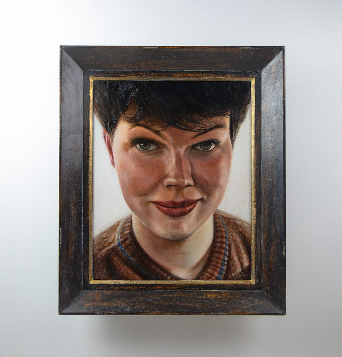
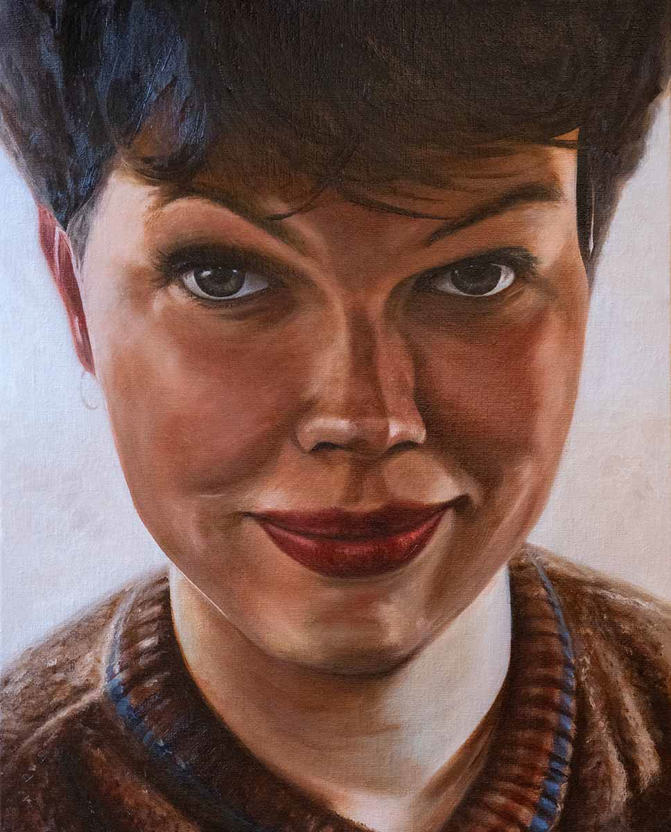
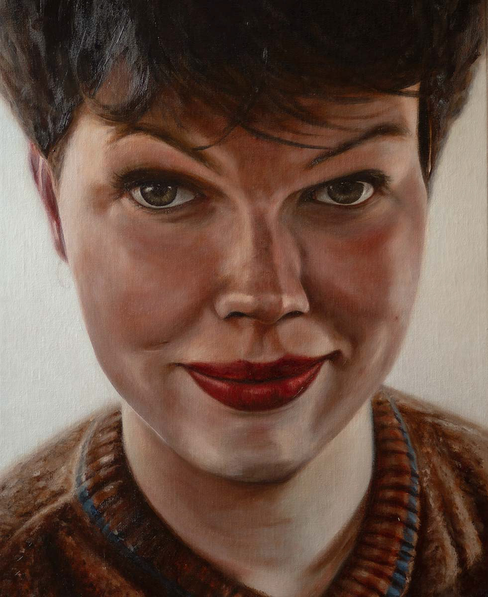
Final Result - Classical Portrait Painting
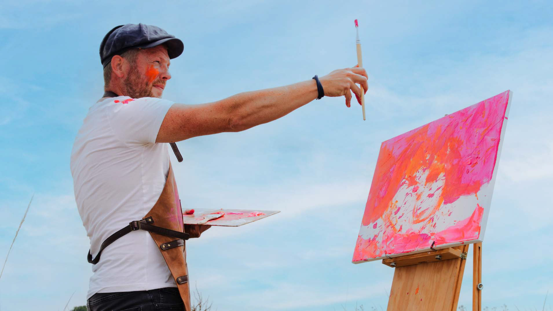
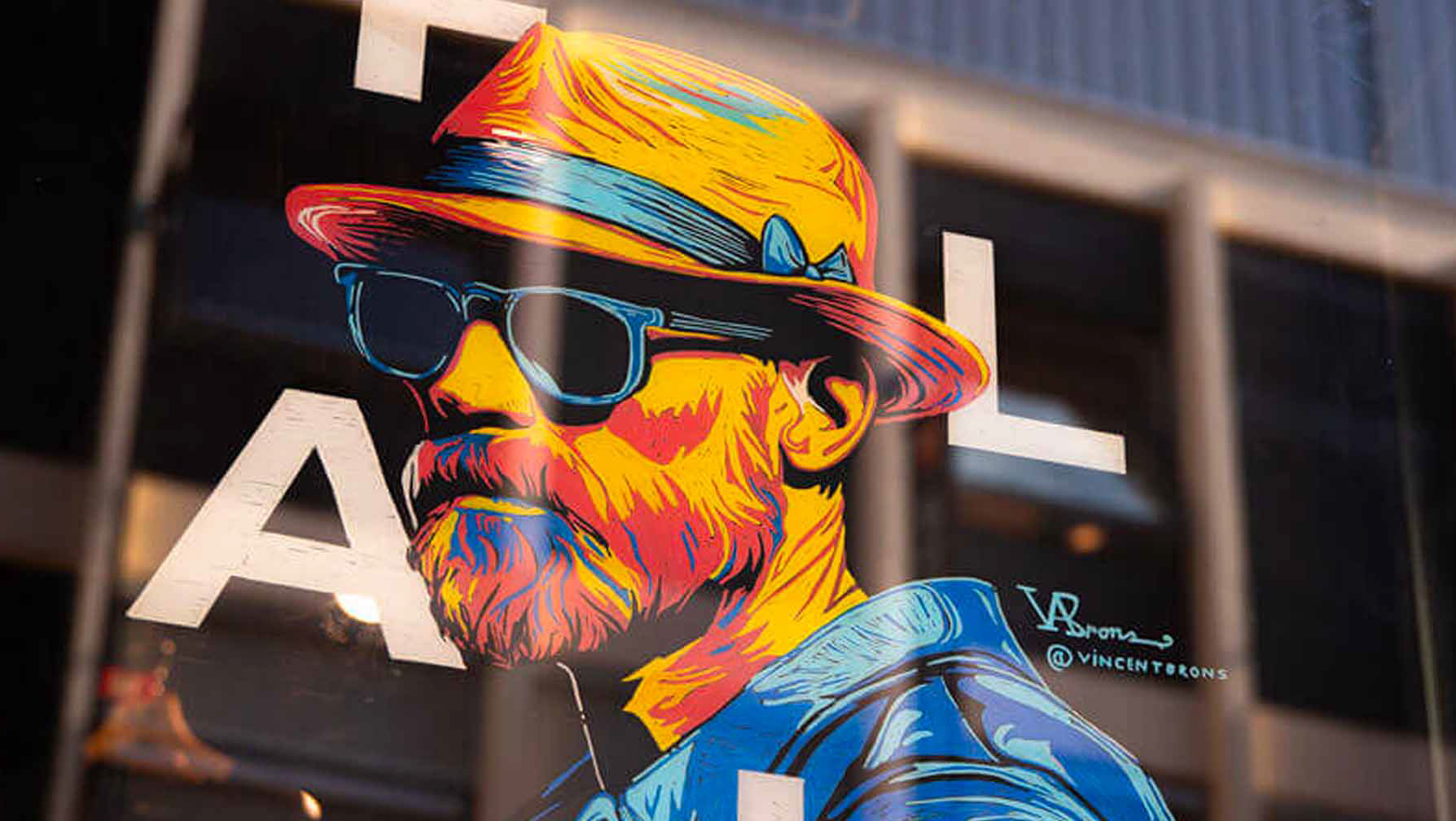
ABOUT THE AUTHOR
A short background on
the Duch artist Vincent Brons
F.A.Q. about classical portrait painting
Frequently asked questions
What does the “fat over lean” principle in painting mean?
Fat over lean means that each new paint layer contains more oil or medium than the previous one. This prevents cracking and ensures a durable painting with good adhesion between layers.
Fat over lean means that each new paint layer contains more oil or medium than the previous one. This prevents cracking and ensures a durable painting with good adhesion between layers.
How do you use glazing medium?
Glazing medium is added to transparent colours to create thin, flowing, translucent layers. This enhances depth and colour luminosity.
Glazing medium is added to transparent colours to create thin, flowing, translucent layers. This enhances depth and colour luminosity.
Which colours are best for glazing?
Transparent colours such as Alizarin Crimson, Burnt Sienna, Burnt Umber, Transparent Oxide Yellow, and Ultramarine Blue work best for glazing.
Transparent colours such as Alizarin Crimson, Burnt Sienna, Burnt Umber, Transparent Oxide Yellow, and Ultramarine Blue work best for glazing.
What does oiling out mean?
Oiling out is the application of a thin layer of oil (or oil-rich medium) to a dull or unevenly dried paint surface, restoring an even appearance to the colours.
Oiling out is the application of a thin layer of oil (or oil-rich medium) to a dull or unevenly dried paint surface, restoring an even appearance to the colours.
How to create an impasto effect?
Use thick paint such as Titanium White, optionally mixed with modelling paste, marble dust, or chalk powder, and apply it with a palette knife or spatula.
Use thick paint such as Titanium White, optionally mixed with modelling paste, marble dust, or chalk powder, and apply it with a palette knife or spatula.
Why is a grisaille underpainting important?
A grisaille helps establish light and shadow before colour is applied, giving the painting greater depth and structure.
A grisaille helps establish light and shadow before colour is applied, giving the painting greater depth and structure.
What is scumbling?
Scumbling is the application of a dry, semi-opaque or opaque lighter paint layer over a dark, dry underlayer. The result is often a hazy, diffused effect.
Scumbling is the application of a dry, semi-opaque or opaque lighter paint layer over a dark, dry underlayer. The result is often a hazy, diffused effect.